The Wildwood Beach Ultimate Tournaments (W2BU) is the world’s large beach ultimate event with several hundred teams and several thousand players in one location for two amazing days of Beach Ultimate. Preparing for, and surviving this experience can be a daunting undertaking, so Lincoln is here to demystify every single aspect and facet of this amazing weekend long ultimate fest.
This is intend to be a comprehensive guide. However, it is far from complete and Lincoln guarantees no specific detail, results, or any of the information contained within. It is incumbent upon each team, captain, and player who reads this guide to do their own research, set their own expectation, and come to their own conclusions. If you find any inaccuracies or have suggesting for changes or inclusions, please comment on the Reddit thread at http://www.reddit.com/r/ultimate/comments/1hfvef/lincolns_guide_to_the_wildwood_beach_ultimate/ and Lincoln will make every opportunity to make changes and corrections.
As with all things published on the internet: Things are subject to change and YMMV (Your Mileage May Vary).
ABOUT W2BU
What is W2BU? Wildwood is the largest beach ultimate tournament in the world. It has been running since 1992 and annually hosts approximately 400 teams, made up of around 5000 players. There are about 150 or so fields setup, and games playing non-stop from 9 to 5 on both Saturday and Sunday. It is an incredibly fun and exciting tournament full of great people, amazing ultimate, and outstanding spirit. Lincoln cannot recommend this tournament enough.
When is W2BU? Wildwood takes place the last weekend of July every year. Here’s a rough schedule for the next ten years…
July 27-28, 2013
July 26-27, 2014
July 25-26, 2015
July 30-31, 2016
July 29-30, 2017
July 28-29, 2018
July 27-28, 2019
July 25-26, 2020
July 24-25, 2021
July 30-31, 2022
What can I expect? You can expect to play 4 full games of Beach Ultimate on Saturday and anywhere from 1 to 3 games of Beach Ultimate on Sunday. Each team is also allotted a certain amount of free food and water, to keep energy up. All players over 21 also get access to the Beer Garden on Saturday Night with free beer, live music, and films of past tournaments.
What can I REALLY expect? You can expect to meet a lot of really cool players and teams, to see crazy layouts everywhere you look, and to have the time of your life. This is not hyperbole. Almost anyone who has ever gone to Wildwood once, returns the next year.
How Much does W2BU Cost? The only official expense for W2BU is registration, which, as of 2013 was $400 per team. If you carry a team of about 10 players, this is $40 per player. That said, the other costs of Transportation, Accommodation, Food, Alcohol (optional), vary greatly. Lincoln’s personal estimate is that it runs somewhere around $400 per person.
Where can I find out more Information? You can visit the W2BU Website, W2BU Facebook Page, or W2BU Twitter account to stay up to date on all the latest details.
TEAMS
How is W2BU Structured? W2BU is structured into different divisions, each with any number of sub-divisions and groupings. A team registers for one division. Within each division teams are divided into a Class. Each Class is further divided into Pools with 4 teams in each pool. So for any given team you will have a division (2/2 beer, 3/1 Competitive, etc), a Class (Golden Monkey, Helios, etc), and a Pool (as determined by your team letters).
What Are the Different Divisions? There are currently four different divisions of play for which a team may register. Each division is outlined below…
- 2/2 Beer – 2 Male, 2 Female on the field for each point. Beer Divisions are for teams who care more about fun than winning. Commonly, beer division games will often, but not always, feature more casual play interspersed with practices like boat races, disc chugs, beer points, bust-a-move points, T-Rex vs Pterodactyl, and the like. If you are not interest in such antics, go play Competitive.
- 3/1 Beer – 3 Male, 1 Female on the field for each point. Beer Divisions are for teams who care more about fun than winning. Commonly, beer division games will often, but not always, feature more casual play interspersed with practices like boat races, disc chugs, beer points, bust-a-move points, T-Rex vs Pterodactyl, and the like. If you are not interest in such antics, go play Competitive.
- 3/1 Competitive – 3 Male, 1 Female on the field for each point. Competitive Divisions are for team that want a more competitive setting of play and are less interested in the goofy alcohol fueled antics of the Beer Division. If you want to be serious about the game, play this division.
- Juniors – For teams 18 years old and younger. I’m not sure what the enforced gender ratio is. Junior division is for our younger participants.
Which Division is Right for You? Ultimately, which division is right for your team is up to your own judgement. In the Beer divisions you should not be surprised if opposing team challenge you to beer related points or contests and other silliness now and then. Beer divisions also tend to be more casual about the games as a whole. Competitive division is more about the pure joy of ultimate and the love of the game without all the beer division silliness. Teams in the competitive division are giving it their all to win the game, versus beer division teams which are giving it their all to fight off the hangover from Friday night.
Which Time Slot should A Team Choose? Some divisions have the added choice during registration for if you would like the first or A slot (earlier) or the second or B slot (later). The First/A slot games play earlier than the Second/B slot and then games alternate from there on in. See below for the schedule. Choosing a specific time slot during registration is not a guarantee of that time slot. The organizers reserve the right to assign you to whatever time slot is necessary for field balance.
How Do You Build a Team? To build a team, get 10 or so of your closest Ultimate Frisbee friends to agree to go spend the weekend in New Jersey playing Beach Ultimate. This is much harder than it sounds. Being very organized about the whole thing will help greatly.
How Big Should a Team Be? Lincoln personally recommends you carry 2.5 to 3 times the number of players that must be on the field at any given time. For 2/2 teams Lincoln would carry 5 to 6 males, and 5 to 6 females. For 3/1 Lincoln would carry 7 to 9 males, and 3 to 4 females. You should be prepared for the eventuality that several of your players might get hurt or otherwise impaired from playing after you arrive at Wildwood.
How Do You Find Male Players? Show up at your local Ultimate Frisbee league and shout out that you are looking for guys for Wildwood. Should be a swarm of them.
How Do You Find Female Players? This one is usually a little tougher, unfortunately, to do. Lincoln believes in home growing female players by introducing new women to the sport and encouraging them to get out and play as much as possible.
REGISTRATION
How do You Register a Team? Once you have enough people to move forward with a team, you go online to the W2BU website to register it. It is recommended that you register earlier for better field position, although Lincoln has never found this to matter in the slightest. The Team Captain should register the whole team at once by going to the website and completing the form. The registration fee ($400 as of 2013) is due at that time.
When Does Registration Open? Registration opens somewhere between March and April. The Wildwood Twitter account or Wildwood Facebook page should have these details, although W2BU is notoriously bad about announcing these details. Personally, Lincoln likes to register in late April.
When Does Registration Close? Unofficially W2BU has never turned a team down, so there really is no ending to the registration deadline. That said, Lincoln would make sure to register by July 1 just to be polite.
How Much Does it Cost? As of 2013, registration costs $400 per team. The current trend seems to be an increase of about $25 per year.
Can I change My Registration After I’ve Registered? Yes, you can. There is an email form at http://wildwoodultimate.com/?page_id=98 that can be completed to contact the organizers. They are VERY HELPFUL and will work with you to make any necessary adjustments. There is also a phone number to call if the email form does not net you any results.
Can I cancel My Registration After I’ve Registered? Lincoln believes you can cancel your registration at any point. Again there is an email form at http://wildwoodultimate.com/?page_id=98 that can be completed to contact the organizers.
Can I get a Refund after Cancellation? Lincoln does not know for certain, but believes the W2BU people will try to return your money if you do cancel your registration. There is nothing on the website to contradict this, but there is also nothing posted about it either.
Do I Need to List ALL Players to Register? No, you do not need to have a set roster to register, or at any point during the tournament for that matter. They only constants is that when your Check-In on Friday night you will be asked for your waivers (see below) and that will be how many wrist bands you receive. That’s the roster number you have.
ACCOMMODATIONS
Where To Stay in Wildwood? Your choices for accommodations at Wildwood are Hotel, Campground, Beach House/Condo, or Sleep in your Car.
- Hotels -There are literally hundreds of hotels in Wildwood and staying in one is probably your best choice. You can find a complete list of hotel options at http://wildwoodultimate.com/?page_id=92. Keep in mind, the following…
- Most hotels, like the Beach House/Condo option below, will be initially reluctant to make reservations for less than 3 nights. However, if you tell them you are “with the frisbee tournament” they often will make an exception because they “love those nice frisbee people.”
- The closer the hotel to the beach, the more expensive the room will be.
- You must be 25 years of age or older to book with most hotels in Wildwood.
- Please be polite to the hotel staff and treat the hotel with respect. Your actions at Wildwood will affect occupancy for years to come.
- Generally speaking, almost all the hotels at Wildwood are best described as Crappy and Small. It’s the nature of the Jersey Shore.
- All Wildwood Hotels will require a credit card to hold the room and about 50% of the cost as a deposit. All have very detailed cancellation policies with most hotels keeping 25% to 50% if you cancel. Read the find print carefully.
- Hotels want you to check out by 11m (or so) on Sunday, so you will need to Checkout and then get to your game. For some hotels this will also involve parking your car somewhere else for the remainder of the day. Please see parking notes below.
- Most hotels come with some form of limited parking. Make sure to ask. For example, you can park up to 2 Cars per room or something to that effect.
- Camping – There are a number of campgrounds in the Wildwood area with very reasonable rates. As with all things Wildwood, Lincoln recommends you make a reservation in advance. You can find a list of Camping locations at http://wildwoodultimate.com/?page_id=95.
- Please note that Camping on the beach is not permitted.
- If you do Camp you will still have to Park your car when you drive over to the beach for your games. Please see parking notes below.
- Beach House/Condo – My personal experience with renting a beach house/condo is that it is incredibly hard to arrange. Most condos/beach house owners want to rent a minimum 4 to 7 night stay and do not really want to rent for the weekend.
- If anyone has more advice on this front please share and Lincoln will happily add the info.
- Every time Lincoln has tried to arrange this it has failed miserably.
- Sleep in your Car – There are always stories about players sleeping in their cars at Wildwood and it appears to be pretty common. If you do sleep in your car you must be prepared to be rousted by the police to move along as it is not permitted in most places. That said, Wildwood is full of nooks and crannies (especially if you get further away from the beach) where you can park for a few hours of shut eye.
- Please note that sleeping on the beach is not permitted.
- Even if you do Sleep in your car you will still need to find beach parking at game time. Please see parking notes below.
How Far Out Should I Book The Accommodation? As soon a possible. Once you have a good commitment from most of your team, get the rooms booked. Most Hotels in Wildwood are generally closed during the winter months, so Lincoln recommends calling somewhere around February to book your rooms. As with all places, the best rooms go the quickest.
WAIVERS
PLEASE NOTE: All details in this section on waivers is SPECULATIVE until confirmed.
What are Waivers? Each player at Wildwood is required to fill out and sign a waiver. This is your standard indemnification waiver that you have to fill out when participating in most sports events. Waivers are submitted to the Wildwood staff AT CHECK-IN where they will be checked for signatures and counted. The number of wrist bands you get will be equal to the number of waivers you submit.
Where is the Waivers Form Found? You can find the Waiver in PDF form at http://wildwood.usetopscore.com/uploads/923/media_items/wildwood-waiver-waiver.original.pdf. You must have Adobe Acrobat Reader installed to view and print the form.
When do I turn in my Waivers? Waivers are turned in, en masse, during team Check-In on Friday night. Your captain should collect the forms and turn them in for all players of the team, instead of having the whole team go over to check-in.
What if I am a Minor? Please have your parent/legal guardian complete and sign the Waiver.
TRAVEL
How do I get to Wildwood? You can Fly and Drive, or you can just Drive. Here’s a Google Maps link http://goo.gl/maps/2R0VO. Figure it out from there.
Where Should I Fly Into? There’s an airport in Atlantic City which is just north of Wildwood, but will be crazy expensive unless you are an Oil Tycoon. Otherwise, Fly in to Philadelphia which is about 2 hours drive and then rent a car.
How Long will the Drive Take? Depends on where you are coming from: Boston is about 6 hours although weekend traffic can make that as long as 12 hours; Philadelphia is about 2 hours; Baltimore/Washington DC is about 4 hours; NYC is about 2 to 3 Hours.
Where can I Park? There are a number of “Pay for the Day” Parking lots near the boardwalk at the beach. These are generally your best bet for parking. Street Parking is all metered, all the time, and enforced vigorously. If you do street park, make sure you stay up on feeding the meter. Some meters have cell phone enabled payments. Lincoln’s last parking ticket was $45.
PACKING
What Do I need to Bring? For playing at Wildwood you will probably need a pair of shorts and a shirt for each day, and possibly your swimsuit since this is the beach, maybe a towel as well. Also you will need water for hydration and a LOT of sunscreen. Do not under-estimate how much sunscreen you will need. Lincoln personally recommends spray on sunscreen as the rub-on lotion kind will be very painful once you get even the slightest bit sandy.
Sandsocks? The beach sand can get hot, real hot. Blister hot. One very popular option is the usage of Sandsocks for protection from the hot sand. These are basically socks, with a toughened sole for sand or water usage. Lincoln recommends buying Sandsocks and playing in those, but to each their own. A great Sandsock vendor is Vincere and you can buy them on Amazon.
Other Footwear? W2BU allows players to play in Bare Feet, Sandsocks, or Tennis Shoes (if necessitated due to injury and acceptable to both teams). No cleats or other type of shoe is allowed!
FOOD/EATING
What’s the Best Place to Eat At? Sorry to say, Lincoln has never found a good place to eat in Wildwood. Most of the restaurants are adequate, but not outstanding. But then Lincoln can be a bit of a food snob.
Where’s the nearest Supermarket? There are a number of nearby supermarkets, but Lincoln likes the Shop Rite Supermarket on the way into Wildwood. 1700 New Jersey 47, Rio Grande, NJ .
What is the best way to do a Team Dinner on Saturday Night? First and foremost, avoid taking the whole team to restaurant and trying to get a table. It’s difficult to do and often requires a long wait and exasperated staff. Instead consider these options:
- If your lodging has a kitchen, cook a meal like a big batch of Pasta or something.
- A lot of hotels have grills for use by hotel guests. Fire one up and grill some fat steaks and veg, or whatever your food is.
- There are a number of decent pizza places down on the boardwalk. Buy a few pies and walk out onto the sand for a sand pizza picnic.
- If you are camping, campfire cooking is awesome. Roast some weenies and s’mores.
- Prepare ahead of time and bring deli fixins and let your team make sandwiches and hang out.
CHECK-IN
What is Friday Night Check-in? All teams must Check-In on Friday night to turn in their Waivers and collect their Team Packet. The Team Packet includes your schedule, your free stuff card (for water and food), wrist bands, and any promotional sponsor items. You will also need to get the time and location of your first three games for Saturday. These are usually posted inside the Check-In room. It is the Captain’s responsibility to write down the information and inform your team.
What do I need to Bring to Friday Night Check-in? You will need to bring a completed waiver for each player of your team. Also, because Registration is in a bar you should bring a photo ID to get inside.
Where is Check-In? Check-In takes place at the Bolero Resort & Conference Center, 3320 Atlantic Avenue, Wildwood, NJ. It is actually held at the bar/nightclub attached to the hotel, so don’t go into the hotel, but go next door to it. You will see a lot of Frisbee players standing around outside probably. Once inside go up the stairs to your left and get in the line wrapping around the upper level.
When does Check-In Open/Close? Check-In begins at 8pm on Friday night and runs until about 12am Saturday. Be warned that the check-in line can be VERY LONG. Buy a beer at the bar and make friends with the people around you.
Can I Check-In Saturday Morning? I believe there is a limited check-in available Saturday morning, but I have no idea where this takes place. Anyone got any info on this?
What are the Wrist Bands For? Each playing person is required to have a wrist band. That said, nobody really seems to care. But, you absolutely must have the Wrist Band in order to get into the Party on Saturday Night.
SCHEDULE OF GAMES
What is the Schedule? Below is a rough outline of the schedule. Please be advised that the schedule may change.
| DAY |
STARTS |
ENDS |
CLASS |
TYPE |
| Saturday |
9:30am |
10:15am |
A |
Pool Play |
| Saturday |
10:30am |
11:15am |
B |
Pool Play |
| Saturday |
11:30am |
12:15pm |
A |
Pool Play |
| Saturday |
12:30pm |
1:15pm |
B |
Pool Play |
| Saturday |
1:30pm |
2:15pm |
A |
Pool Play |
| Saturday |
2:30pm |
3:15pm |
B |
Pool Play |
| Saturday |
4:00pm |
4:45pm |
A |
Pre-Quarters |
| Saturday |
5:00pm |
5:45pm |
B |
Pre-Quarters |
| Sunday |
10:00am |
10:45am |
A |
Quarter Finals |
| Sunday |
11:00am |
11:45am |
B |
Quarter Finals |
| Sunday |
12:00pm |
12:45pm |
A |
Semi Finals |
| Sunday |
1:00pm |
1:45pm |
B |
Semi Finals |
| Sunday |
2:00pm |
No End Time* |
A |
Finals |
| Sunday |
3:15pm |
No End Time* |
B |
Finals |
* The Final games are played to points, not an ending time.
When do we show up for the First Game of the day? Please, please, please get to the field for your first game 1 hour before the game starts. It will take your team a lot of time to get setup, warmed up, and ready to play.
When do we show up for subsequent Games? After each game there is at least 1 hour of time before the next game, you can show up to your next field a little more casually. That said, try to get over to the next field with about 30 minutes to allow for more warm up, meet and greet, etc.
PLAYING
What Do I Need to Know as a Player? Play hard, play with spirit, and have fun. Oh, and sunscreen is critical. And hydration. Don’t forget the hydration!
What Do I Need to Do as a Player? Help your captain. Get your ass out of bed in the morning and to the field on time. Show respect for your fellow players.
Is a Team Captain required? While it is not required to have a captain for a team, most teams usually have someone who does the majority of the organizing, the cat herding, and the score reporting. That’s your captain. Show them some respect and buy them beer.
What Does a Captain Do? As captain your responsibility is to…
- Check-in your Team (see above).
- Inform your Team about when and where they are playing.
- Get your team to the field on time, about 1 hour before game time for the first game.
- Report the score when the game is over. Make sure you do this even if the other team says they are going to do it. Do not rely on the other team to do it.
- Agree with the other team over any special rules, beer points or the like.
- Lag the disc or appoint someone to lag the disc for determining the initial pull.
- Be cognizant of the rules.
- Be aware of the time, stop horn, and the like.
- Set the example for on field spirit and awesomeness.
How Do I Captain Well? Lead by example, be super spirited, and don’t over-think the chaos around you. Most importantly, get your team to the field on time. The other team is waiting on you.
TIME LIMITS AND HORNS
How long does Each game run? Each game begins at the allotted time. One long blast of the horn will sound to signal the beginning of each game. Games are played for 45 minutes, except for the Finals which have their own rules. Three short blasts of the horn will indicate the end of the round. When the three shorts blasts of the horn occurs, the following rules come into play.
- If a point is in progress at the sound of the horn, finish the point.
- If after play has stopped one team is ahead by 3 or more points, that team wins.
- If a team is winning by 2 or less points, then another point is played until there is a team with a higher score. (Essentially, a hard cap is established at 1 more point greater than the team with the higher score.)
- A team does not have to win by 2 points.
- If the time reaches the time for another game to begin, the game is over. In the event of ties, see Specific Rules below for resolution.
How long does the Final game run? The final games is not timed, but rather 3 games played to specific points. The best 2 out of 3 games wins. The firs two games are played to 7 points. The third game, if needed, is played to five points. In the Finals, each team gets 1 time out per game. In the Finals, each game is separated by 3 minutes before the next game must begin. In the finals, the team that scores the winning point will begin the next game by pulling from the end zone they scored in.
What do the horn blasts mean? The horn is used to signal the start and the end of each game. The patterns have the following meanings:
- One Long Blast: This indicates the start of a game.
- Three Short Blasts: This indicates the end of a game, 45 minutes after the start of the game.
SPECIFIC RULES
What are the Official Rules of Wildwood? Wildwood follows the World Flying Disc Federation (WFDF) rules for ultimate with the 4-on-4 Beach Ultimate Appendix. Additionally Wildwood has it’s own set of rules that you can find at http://wildwoodultimate.com/?page_id=66.
How Long does a Game Run? Each game will be played to 45 minutes in Pool Play, Pre -Quarters, Quarter Finals, and Semi Finals. All games have an extra ten minutes for any additional play that may be needed after the horn goes off.
How does the final Championship Game work? The championship game will be the best two-out-of-three 7-point games, with the third and deciding game played to 5 points. Each team has one time-out per game. No carry-overs of time-outs into the next game. The team that scores the winning point of the first and second game will start the next game by pulling the disc from the end zone that they scored in. 3 minutes between games.
Is Gender Matching Required? Each team must field exactly the gender dictated by their league for each point. For 3/1 Leagues, you must have 3 male and 1 female players on the field. For 2/2 it is 2 male and 2 female players. If a Team cannot field those numbers, they may play down a player.
What is the Lag? The captains of each team will choose a representative to “Lag†the disc. One representative of each team will throw the disc from the back of the end zone, trying to get it closer to the back of the opposite end zone without the disc going over the line. Both representatives throw the disc at the same time on a count of three. If both discs go over the line, then the closer to the back line wins the choice of either starting on offense or selecting which end zone to defend.
What are some alternative to Lagging? Any game or challenge which both team can agree to is acceptable in place of lagging. If nothing is acceptable, please use the lag rules. In Beer Leagues challenges like Boat Races, Shotgun Races, and Disc Drains are common practice.
How must a Pull be Done? Each pull must be an inverted type throw (Hammer, Scoober, etc). When the disc is pulled it shall be at least 91 degrees (perpendicular) to the ground.
What happens when the Disc Goes Out of Bounds on the Pull? If the disc first touches the ground in bounds or touches an offensive player and then rolls out of bounds on the pull, play is resumed at the point where the disc exited the field. This includes discs that travel out the back of the end zone. If the disc becomes out-of-bounds without first touching the playing field or an offensive player, the thrower may establish the pivot either at the brick mark closest to their defending end zone, or at the spot on the playing field proper closest to where the disc went out-of-bounds. The brick option must be signaled by the intended thrower before picking up the disc by fully extending one arm above their head.
What happens when the Disc Goes Out of Bounds not on the Pull? If the disc travels or rolls out the side of the field, play is resumed where the disc exited the field. If the disc goes out the back of the end zone, the defender who takes possession may play the disc at the back of the end zone or at the goal line.
How long is the Stall Count? The person with the disc has 6 seconds to throw the disc to a teammate. The defender (Marker) guarding the thrower counts the seconds out loud (“stalling one, two, three…â€). The Marker must be within 3 meters of the thrower to initiate the stall count, and must stay within 6 meters of the thrower.
Are Boundary Lines In or Out? The boundary lines are part of the playing field proper. If the bottom of the players foot steps on the line, then they are considered in-bounds. If they drag the lines out of their original position, they are to be considered out-of-bounds.
How Does the Two Point Rule work? Any throw that travels from the defending end zone to the scoring end zone is worth two (2) points instead of the usual one (1) point. The end zone line is considered part of the end zones for the purposes of determining if the score is a two point or a one point. For any play where the disc is walked up to the front of the end zone, the throwing player is considered to be in the end zone for determining if the throw was worth two or one points.
How many Timeouts does a Team get per Game? Each team is allowed two (2) Timeouts per game in the Pool Games, Quarter Finals, and Semi-Finals up until the horn sounds. Only one (1) timeout can be used after the horn has sounded. In the Finals, Each team has one time-out per game. No carry-overs of time-outs into the next game.
How Do Games End? All games, except the Finals, are timed. The horn will sound three short blasts at the end of allotted time for each type of game. When the three shorts blasts of the horn occurs, the following rules come into play.
- If a point is in progress at the sound of the horn, finish the point.
- If after play has stopped one team is ahead by 3 or more points, that team wins.
- If a team is winning by 2 or less points, then another point is played until there is a team with a higher score. (Essentially, a hard cap is established at 1 more point greater than the team with the higher score.)
- A Team does not have to win by 2 points.
- If the time reaches the time for another game to begin, the game is over.
How are Ties resolved? Ties are resolved by point differential between the teams involved. If there is still a tie, then it will be point differential between all teams in the pool. Please consult the Scoring personnel at the Command Center.
What type of Footwear is allow? W2BU allows players to play in Bare Feet, Sandsocks, or Tennis Shoes (if necessitated due to injury and acceptable to both teams). No cleats or other type of shoe is allowed!
FIELDS
How to Find Your Field? Each team is provided a field map during Check-In. Additionally, each field is numbered at one end with a placard that says “Field XX”. Figure it out. Make sure before you play that the team your are playing against is on the right field. If you see a fallen field placard, please replace it/stand it up.
What is Combing the Field? The first team that plays on a field should spend a few minutes before the first game “combing” the field. This is done by both teams lining up on one end of the field and walking, as a unified line, to the other end. As you walk pick up any glass, sharp sea shells, nails, or other detritus that you find that could cause injury. This is VERY important to do as the Wildwood sand can hold all kinds of vicious and sharp objects.
Where is the Command Center/Medical Tent/Score Reporting/Food Distribution/Sponsor Tent? In the middle of all the fields, at the Ocean end of the main pier, called Morey’s pier.
WEATHER
Rain or Shine? Wildwood games are played whether it is raining or sunny, hot or cold. Please prepare for all conditions and dress accordingly. Standing water on the field after a rainfall is not uncommon and should be played thru. Honestly, that’s part of the fun.
What about Lightning? The exception to the above is that in the event of Lightning or Severe storm, all games are stopped and cover should be sought. Any game stopped due to lightning or severe weather is considered paused until the expiration of game time at which point the last standing score becomes final.
MEDICAL
Where Is the Medical Tent? At the end of the Morey’s Pier at Wildwood is the W2BU command center and Medical Tent. Please go there for any non-life threatening emergency. For a life threatening emergency, please call 911.
What Services does the Medical Tent Provide? The medical tent is there for any non-life threatening emergency or Ultimate Frisbee medical support services. In particular they can provide ankle/foot/toe/hand wrapping prior to playing to help minimize injury. Injury Massage and treatment is also available. If you are thinking of getting an ankle/foot/toe/hand wrapped on Saturday morning, go over extra early as a bit of a line can form.
REPORTING
Where do I Report My Scores? Near the Command Center, at the end of Morey’s Pier, there will be a large moving truck. Each side of this truck has schedules posted on it. Report your scores here to the personnel staffing the score sheets.
How Do I Report My Scores? You send a team representative to the Scoring Truck (see above). Once there you will find people at the side of the large truck with the schedules on it. These people have markers. Politely wait until they are not busy and then tell them your team Division, Class, Team Letters, and scores.
What is the Score Reporting Etiquette? Each team should send a representative to the score reporting area to report the score. If the team you just played reports a different score, ask the scoring personnel to make a correction if you disagree with what was reported. Please be polite to the scoring personnel.
How Soon After my Game Should I Report the Score? You should report the score immediately following your games. This is especially critical during the 3rd game of the day on Saturday. At the end of the 3rd game, your scores and record is used to determine against whom and on what field your next game will be. In order for this to happen, all the scores from your grouping must be turned in.
Can I just Skip Score Reporting and Assume the Other Team Did It? No. That is crazy disrespectful to the other team, the other teams in your group, the personnel working the score boards, and your team. Make the walk, report your score, then take a dip in the ocean.
PROBLEM RESOLUTION
How do I resolve problems prior to Wildwood? There is an email contact form at http://wildwoodultimate.com/?page_id=98 that can be completed to contact the organizers. Start there. Be nice, these people are volunteers.
How do I resolve problems at Wildwood? At Friday night check in, you can ask for assistance resolving your problems. Be warned however, that things are moving pretty quickly and trying to get things resolved then can be difficult and chaotic. Be extra nice to the people working. After Friday night, please contact someone at the Command Center for assistance.
What Happens if our Opponents do not show up for the Game? If after five minutes your opponents have not arrive for the game, check around at nearby fields for them Sometimes teams go to the wrong field. If you still cannot find them, report to the Scoring personnel for assistance.
How do I resolve on the Field Differences? As with any Ultimate Frisbee difference, make the call, contest or don’t contest, move on.
How do I resolve Score Reporting Differences? Ask the scoring personnel for assistance. They can help you sort the matter out.
PARTYING
What’s the Beer Garden? On Saturday night the Beer Garden is a gift from the Tournament directors to the players. It opens at 4pm and runs until 10pm. The Beer garden is open to all attendees whom are 21 years or older and have a valid ID and W2BU Wrist Band. Free beer is available as well as Live Music and films from past years W2BU. Get there early to avoid the long entrance line.
Where is the Beer Garden? It’s near where the Command Center is, at the end of Morey’s Pier.
When Does the Beer Tent Open/Close? The Saturday Night Party runs from 4pm to 10pm. Get there early to avoid the long line to get in.
What Do I need to Get into the Beer Tent? You are required to have a valid photo Id proving your are 21. You must also have your W2BU issued Wrist Band.
What if I’m Under 21? Hang out outside the Beer Garden and enjoy the music.
RESPONSIBILITY
What are my responsibilities as a W2BU Participant? While there is no formal responsibilities for attendees, there are several informal ones.
- Always remember Spirit of the Game.
- Be polite and courteous to the local residents, employees, and visitors. We want to be allowed to come back next year.
- Respect the W2BU Volunteers and let them know how much you appreciate their hard work.
SOME SECRET INSIDER TIPS
Beer or Competitive? If you care about winning, play competitive. There’s nothing worse than playing a team of snotty competitive players whom are slumming in Beer league.
Which Time Slot is Better? Most teams generally want to play in the later game slots so they can sleep in a bit. However, if you want to take the team out for dinner, the earlier slot gets you off the field sooner. Also, if you want to leave sooner on Sunday, earlier slot is better as well.
Register Sooner or Later? Typically, the over aggressive teams register earlier, and the lazier, haphazard teams register later. So, if you looking for less challenge there’s an argument to be made that you should register later. Honestly, this is all guessing though. The one thing the Organizers do say is that registering you earlier gets your fields closer to the command center. Lincoln has never found that to be the slightest bit true and not necessarily a positive thing even if it was true. You really want a field that is closest to your hotel/car.
What’s the Best Way to Collect Waivers from my Player? Get everyone on your team to mail them to you weeks before the event. Otherwise you’ll end up rushing around trying to collect these at the last minute. Do not rely on someone to show up and sign their wavier on Friday before you have to turn them in. Lincoln guarantees you will end up waiting for that person as they are stuck in traffic somewhere.
What the Best Hotel to Stay at? Lincoln is not telling. Sorry.
Should I Really Book the Hotel Five Months Ahead? Well, maybe not five months, but Lincoln would certainly make sure to have it done by 3 months out, say April 15.
How can I Land a Beach House? Good Question, Lincoln will get back to you on that once he knows the answer.
Got Any Good Places to Sleep in your Car? Lincoln does not specifically know any, but if you drive a bit away from the beach Lincoln is sure you can find all kinds of interesting places to park.
How do I avoid the long line for Friday Night Check-in? Four tactics work here…
- Show up later, like at 11:00pm instead of early at 8pm.
- In years past there has been a separate line for 2/2 than there is for 3/1. If you are in 2/2, cut to the front or near the front. Ask around you.
- Buy a buttload of beers at the bar and bring them upstairs with you. Hand out free beers for trading places in line.
- Just drink those beers yourself and get to know the people around you in line.
Do I Really Need to Get the Team out 1 Hour before out first game? Yes! Hell Yes. Lincoln personally likes to get the team moving from the hotel toward the beach 1.5 hours before the game. The reason for this is that 1). It never really happens on time, so some extra padding is good. 2). There is a ton of things to do once you get to the field like find your field, warm up, get your sand socks on, apply a liberal dose of sunscreen, setup your gear, crack your first beer, lag with the other team, discuss strategy, and cheer. Also, do not under estimate just how long it will take to walk from your hotel to the field.
How do I get my Team to the Field on Time? Make it clear when they should be getting up, offer them breakfast if they are up by that time, and leave anyone behind whom doesn’t get their ass out of bed.
What’s the One Must Have Thing to Pack? Something fun like cool costumes, a Sombrero, a six foot long stuffed tiger, what ever fit’s your team name. Have some fun.
Do you recommend a Canopy Tent/Tailgate Tent for Shade? Some players hate the canopy tents because they create dangerous obstacles alongside the fields. That said, the shade the Canopy Tent provides is priceless for surviving the unrelenting sun. If you do setup a Canopy, please try to do it away from the edge of the field (and especially not on the field).
Do you recommend Beach Chairs? Yes, absolutely. Siting on the sand for a whole day can be tough. Lincoln also likes to bring a cooler, but that’s just how Lincoln rolls.
What Do we Do if our opponents Don’t Show Up on time? Be nice, but if they’re not there by 10 minutes after the game start time, report them as forfeiting.
What’s Better Laying Out in Sand or Laying out in Rain Puddles on Sand? Yes.
How Early should I get to the Medical Tent on Saturday for Pre-Wrapping? On Saturday, getting to the medical tent 30 minutes early is recommended as quite a line can form. After that first game, the tent is pretty accessible.
What do I do if the other team reports the wrong score? Discuss the matter with the Score Personnel. They can advise you.
What do we do if the team we are playing is full of jerks? Be polite, be Spirited, and suck it up. Get through it as best you can, the game is only 45 minutes long.
Where’s the Best Post Beer Garden Party? There are lots of Bars around Wildwood. Pick one, make friends with the Ultimate people partying there. Buy them beer. Follow them from party to party.
Where can I find Good Beer? Basically, you are screwed. Wildwood is a dead zone for good craft beer. Bring your own good beer with you.
ABOUT LINCOLN
Abe Lincoln F/Huckers is a repeat offended at the Wildwood Beach Ultimate tournament. We’re in it for the beer. You can find Abe on Twitter at @AbeFHuckers. If you see Lincoln at Wildwood, buy him free beer for all his hard work typing this guide up.  Abe Lincoln F/Huckers is captained by the captain himself: http://www.bartleby.com/142/193.html
 Then one day, while sitting in my favorite lunch spot, having my favorite lunch (beer), I had a moment, a vision, an inspiration. “We should totally open the talk wearing ski masks, like we’re trying to protect our identity.” So I pulled out my iPad and proceeded to write this down. I knew that in order to pull off a ski mask based gag, the dialog would need to be very quick, so I decided to approach it like a theatrical scene using a script. And once I started writing it, once I started working in the script format, the words just poured out of me. It helps that I was an English Literature major in college and writing comes very, very easy to me.
 Also, since the script had a certain flow I had an idea of what slides I thought we should use. Plus I knew there were just some slides I had to have in the talk because I love the images, like this IT Crowd one… Mandatory for any talk in my opinion.
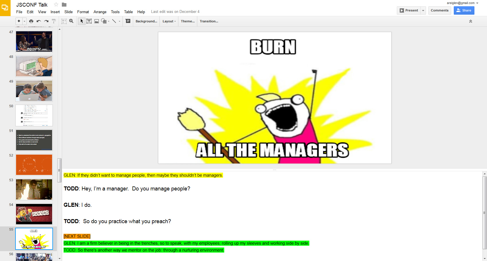
 On Thursday I flew down to Jacksonville. It’s a two hour flight from Baltimore, plus a few hours sitting around in the airport. I re-read the slides a dozen times. I had one particularly long speech that I just couldn’t seem to get down so I keep going over it over and over again. I’m pretty sure the couple sitting next to me on the plane thought I was some sort of crazed lunatic because I just kept staring at my iPad and mumbling to myself under my breath; and then every time the “Points for Glen” slide would come up I would throw my arms up in the air. I’m pretty sure there wasn’t a sky marshal on the flight or I would have been detained.
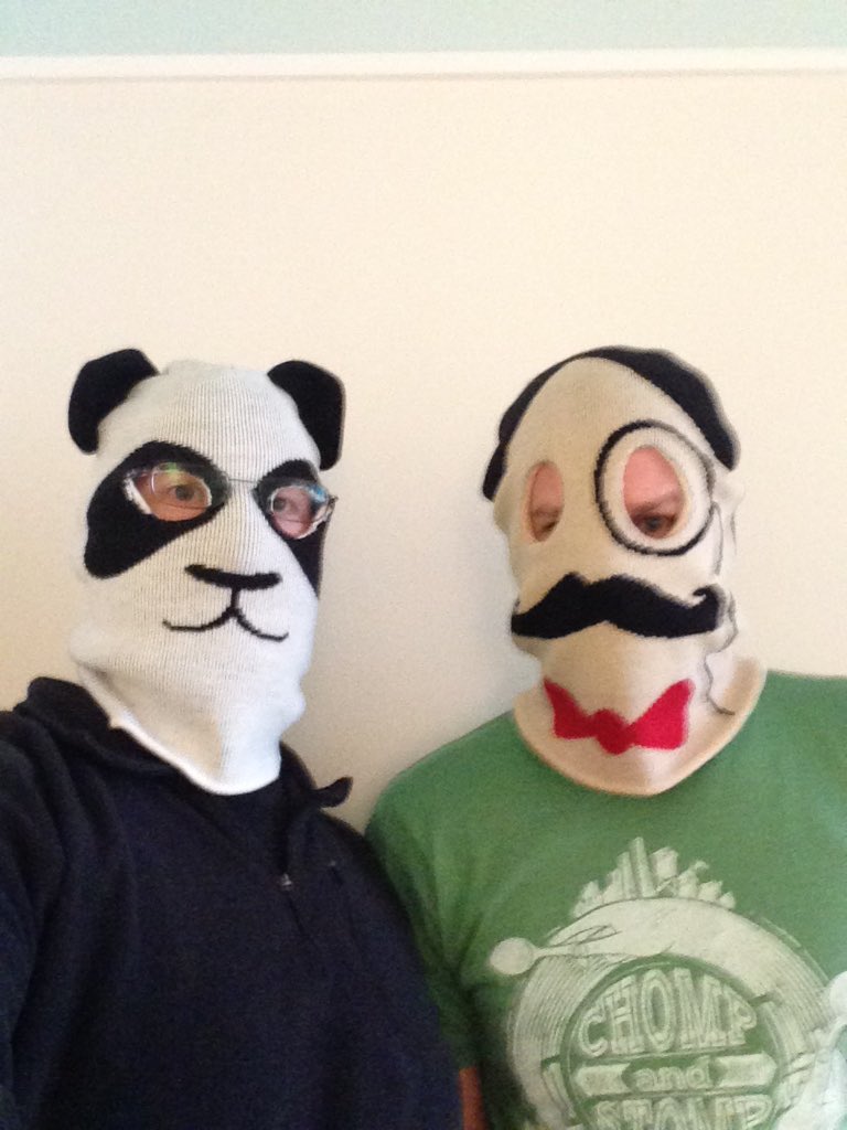 I know a lot of people laughed, which was so amazing. I knew we had a few jokes in there, but never expected our audience to laugh as much as they did. And the laughter started the minute we stepped on stage. I’m told we looked utterly ridiculous. I remember telling myself prior to the talk that “if we got some laughs, just wait a second or two for them to die down before continuing.” Problem was, in the intro, the laughter didn’t stop. People genuinely thought what we were doing was funny. That made the speech for me right there.